Salone del Mobile 2016
|
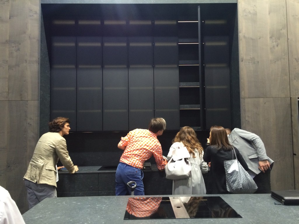
The Salone del Mobile in Milan www.salonemilano.it/en/ must be the most important furniture fair in the world and is now in its fifty fifth year. Visiting the show has been a crucial element of my work for fifteen years. The main event is held in the Fiera which is a series of large exhibition halls each one as big as an entire trade exhibition elsewhere. Only the best is on show from leading European manufacturers. Milan embraces the event. There are many exhibitions around the city featuring less established designers, students or smaller companies and some who are perhaps too cool to be confined by trade show, Tom Dixon www.tomdixon.net/uk/ and Mooi www.moooi.com being two of those. Often a leading company will sponsor an art installation, this year it was Citizen Watches with work by DGT Architects www.dgtarchitects.com/project/detail/it16/en#mov Our entire Studio goes, all staying in a large apartment for a week, we have fun but we are not there just to party. We are exposed to more brands than we could possibly visit in one year. We are there to find new interesting manufacturers as well as see the new ranges from our existing suppliers. It’s a great opportunity to pick up on the latest trends but most importantly it is a chance for us all to be inspired . As you can see by the photo we certainly scour everything in great detail!
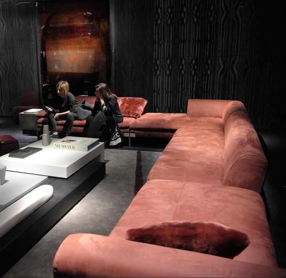
Here is my view of main show at the Fiera. I don’t know what it was in Milan this year but there was a certain buzz, a level of confidence amongst the stands and an excitement that has at last returned after the dreariness of recession. There are so many brands to see at the Fiera, all of them different, each with an individual personality, just as artists differ from each other. As with artists though one might prefer one over another, however I was not hunting for a favouite, I was looking for a feeling, a mood manifested in colour and shape that might be repeating amongst the various companies . Is there a trend emerging, is there one dying? I headed for the Baxter stand because as always they feature the most exciting and radical room sets, which can set the whole tone of the fair. There I discovered a room decorated in shades of grey, no surprise there but in it was a seductive sofa in soft dusty pink in suede which stretched through the room and cried out, “don’t just sit on me, lounge on me” . The coffee table in front of it reflected that emotion too, made of a collection of different shapes at different heights made of contrasting burnt wood and shiny white lacquer, this table wasn’t just a singular piece of furniture sitting in front of a sofa but more of an installation . The scheme had a daring almost futuristic look, softened by ancient textiles set in resin by http://dragaobradovic.com and papers by Wall and Deco http://www.wallanddeco.com/en/which are more like stage sets rather than wallpaper.
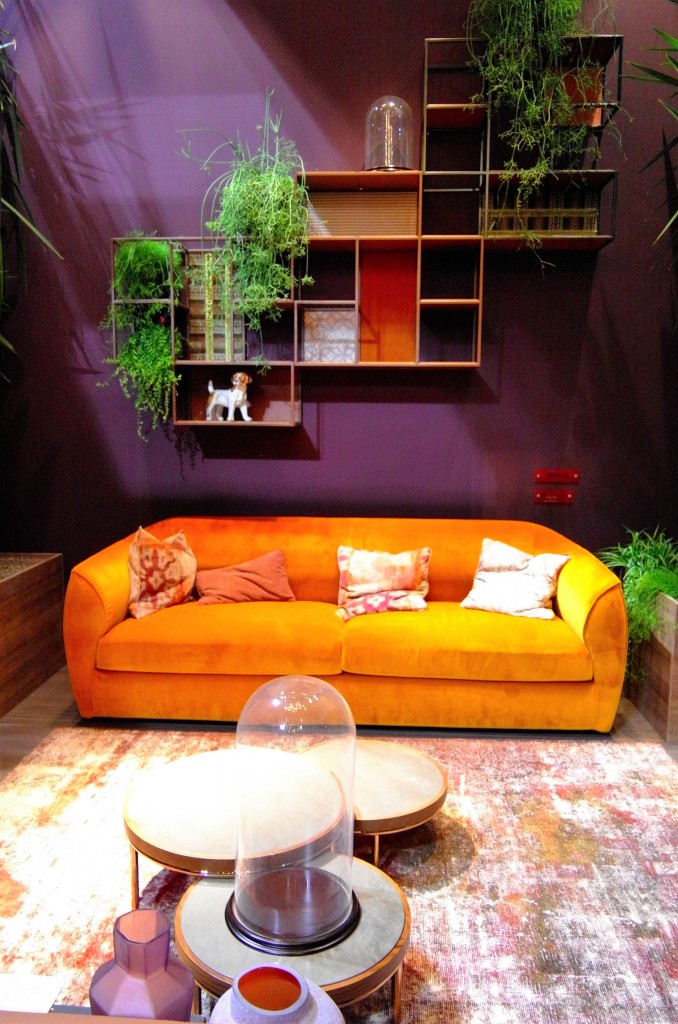
Dusty rose pink was a popular colour at the show as was a rather warming golden orange, again used to great effect by setting off otherwise monotone schemes. Terracotta is still around and as in previous years is partnered with teal, a classic combination and clearly still popular.
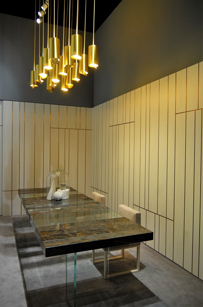
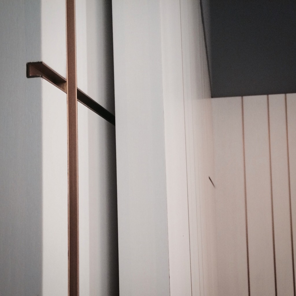
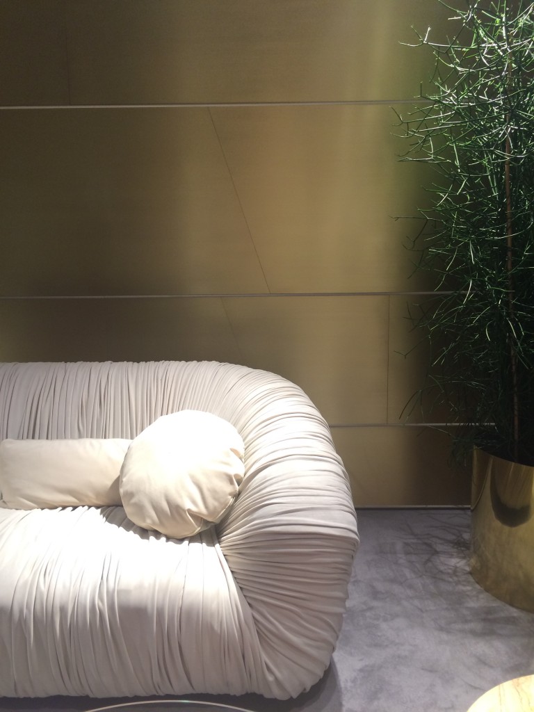
Emerald green and Navy blue were seen especially in luxurious velvet. Ceccotti had delicious wall panels in both those colours which set off their exquisite furniture often carved from solid wood. http://www.ceccotticollezioni.it/ Wall panels were almost on every stand, finished in grey stained oak, parchment, exotic veneers and fabrics. So many finishes but nearly all were edged in brass beading. A detail I’ll certainly be bringing home.
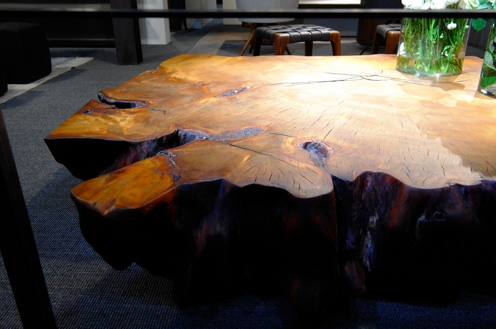
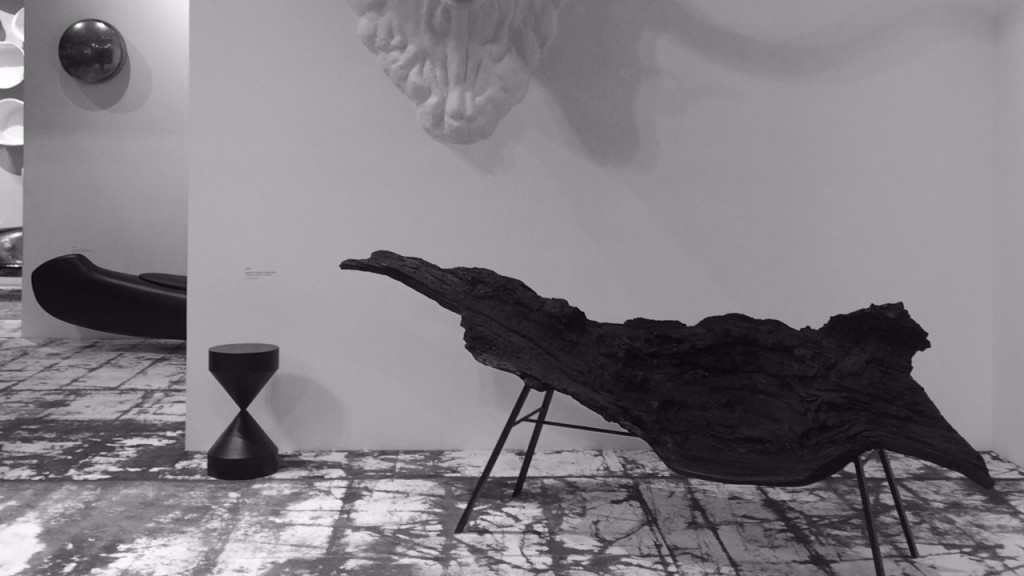
Raw woods looking as if they had just been chopped down featured everywhere in the show. Tuned into the wildest dining tables by Riva 1920, they were getting a great deal attention from the world’s leading buyers and designers.
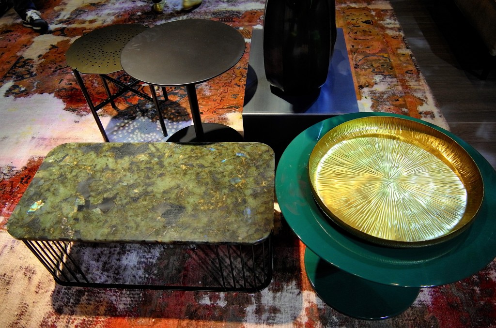
There has been a new approach to coffee tables design . Baxter’s was certainly a star but others were also deconstructing this very familiar piece of furniture using disparate elements, vintage/new, shiny/matt, high/low.
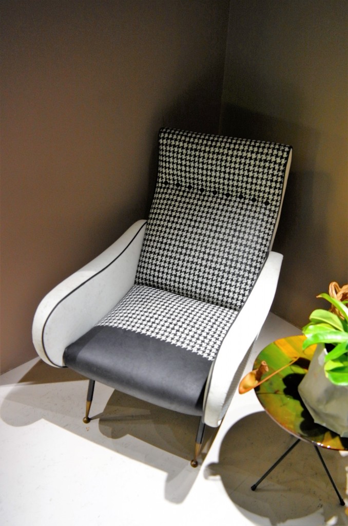
Plants featured everywhere, pots and pots of Rosemary and cheese plants. Most were displayed on wall hung metal cubic shelves where the plants alternated with (dare I say it), ornaments. I can imagine seeing those shelving units on the high street very soon. There was not much repetitive pattern around it was more about washed out, over scaled motifs. However I did see cropping up the occasional Houndstooth, always in black and white but in different scales. I even saw a stylish designer striding past in the pattern, it must coming up for a revival. it will certainly be a good antidote for those moody, dark grey schemes.
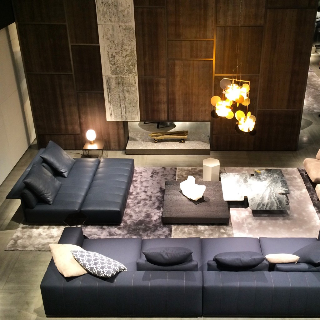
I also visited my old friend Minotti www.minotti.com Their furniture is so easy to use as it sets well in any scheme and each year’s collection easily works with previous years. They have moved towards sophisticated, hard to copy detailing. I especially loved their reverse seaming in leather.
|

 Imperfettolab –